Redesign flower buying website to simplify selection and improve transparent pricing
INTRODUCTION
This project involves redesigning e-commerce website for a local, brick-and-mortar florist. The goal is to improve user experience (UX) while maintaining the focus on quality customer service.
Beethoven’s Veranda is a NYC area florist business where award-winning design meets hand-picked flowers for stunning arrangements.
Beethoven’s Veranda
My role
Full stack UX/ UI designer. Solo.
Timeline
14 days
Tools
Figma, Figjam, Google suite, Optimal Workshop, Maze
PROJECT OVERVIEW
Users want to easily buy flowers online but struggle because of overwhelming choices and hidden costs inflating the original price.
Problem
Outcome
The redesigned website streamlines the flower ordering process by personalizing options for both personal and gift buyers, with upfront cost transparency.
UNDERSTANDING THE PROBLEM SPACE
I started the project by conducting heuristic evaluation on the existing website. This helped to establish usability roadblocks hindering the current user experience. My findings:
Usability Research
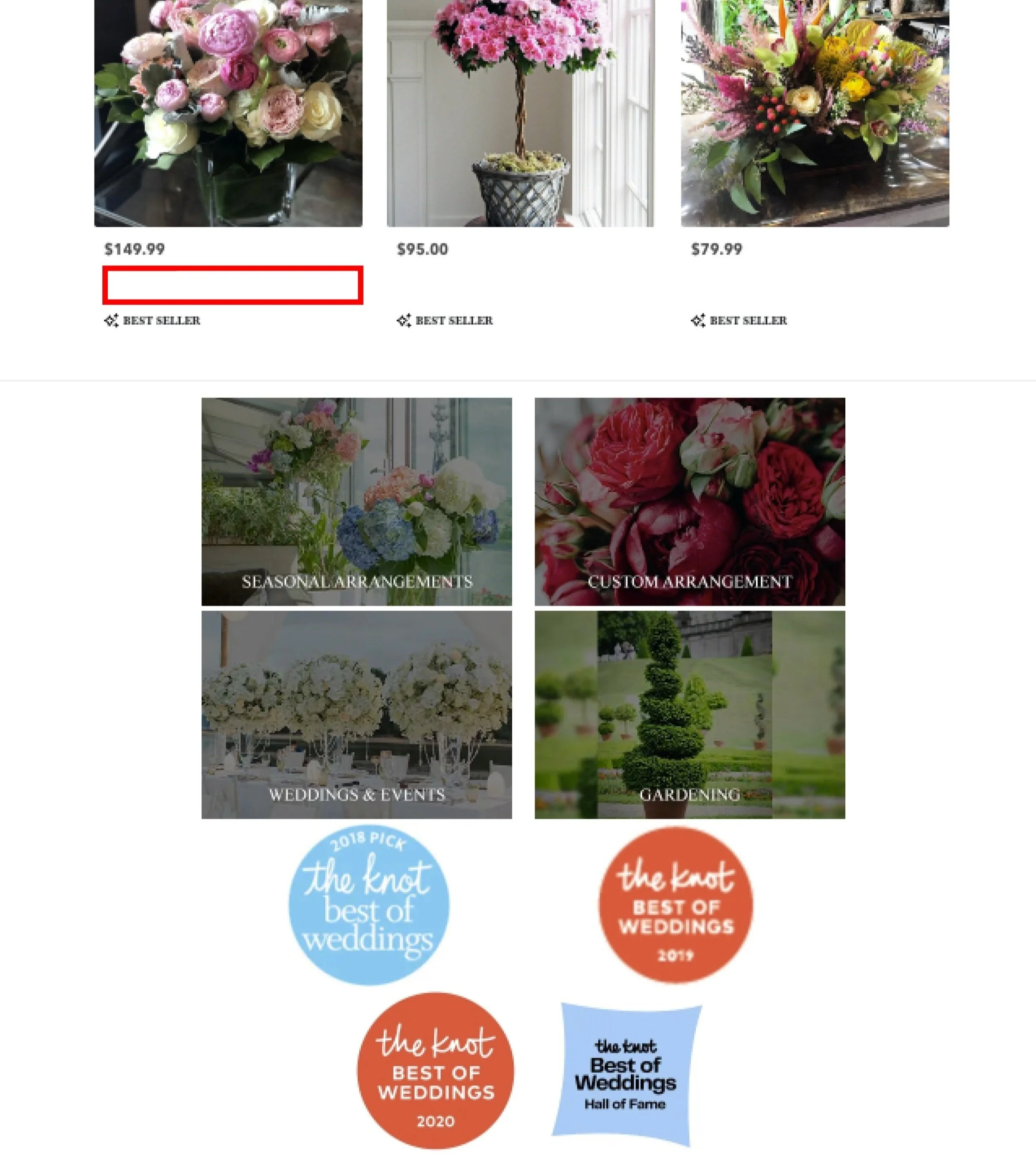
Challenging navigation: hinders user context and exploration. Missing contextual cues and page names on home, product and checkout pages.
Incomplete information: when selecting a bouquet, users make decisions based on insufficient information (missing product names).
Poor design: cluttered layout, featuring numerous subcategories, buttons, and inconsistent UI elements.
RESTRUCTURING THE IA
I conducted a closed card sorting session to evaluate user understanding of existing IA categories, particularly the absence of a ‘shop’ category, and its potential intuitiveness for users.
IA Goals
Introduce ‘Shop’
a preference for a clear "Shop" category for everyday and gifting bouquets
Preferred Sorting
an expectation for browsing bouquets by "Price," "Occasion," and "Color."
Introduce ‘Celebratory Collection’
a dedicated category for ‘Bridal Bouquets’ and ‘Event Bouquets’ to streamline the selection process for these special occasions.
I researched elements of other florists to understand what already existed in the space and find gaps in the market. Here are my key takeaways:
UNDERSTANDING THE MARKET SPACE
Our Strengths
Verified reviews on each product page
Same-day delivery & hand-delivery
Since BV sells high-quality products (backed by reviews), we have a chance to increase their process.
Option to customize floral arrangements
Market Gaps
Most of them don’t:
offer reviews for the bouquets
send a follow-up after delivery
help to decide which bouquet to order
offer search option.
Their Strengths
Founder's narrative build trust & user connection.
Flexibility and control in size, delivery date/time & zip-code selection.
Information on care tips, packaging, order tracking.
Cater to budget, time-pressed, indecisive customers.
Consistent UI with clear CTAs guides users.
UNDERSTANDING THE USERS
To understand user motivations, needs, and frustrations, I conducted 6 user interviews that primarily informed the website redesign of Beethoven's Veranda.
User research method & findings
There are too many options. It is so overwhelming to select the best one.
I want upfront pricing.
I want early visibility of in-stock options & product details.
I value florist’s expertise.
I want to track my delivery.
How might I curate product options on florist websites? How might I inform the users of in-stock options at an early stage of their search?
OPPORTUNITY
Following the redesigned IA and navigation, I focused on creating clear and user-friendly wireframes. To address user concerns about feeling overwhelmed and a lack of consistent UI, I prioritized:
clean, square UI elements to juxtapose with soft-edged flower imagery for contrast and visual appeal.
ample white space: emphasizing white space to enhance content clarity and reduce decision fatigue.
IDEATION
DESIGN DECISION #1
Zip code & delivery date filters
Implement zip code & delivery date filters on homepage for in-stock options & clear delivery fees. This will allow users to curate their options.
DESIGN DECISION #2
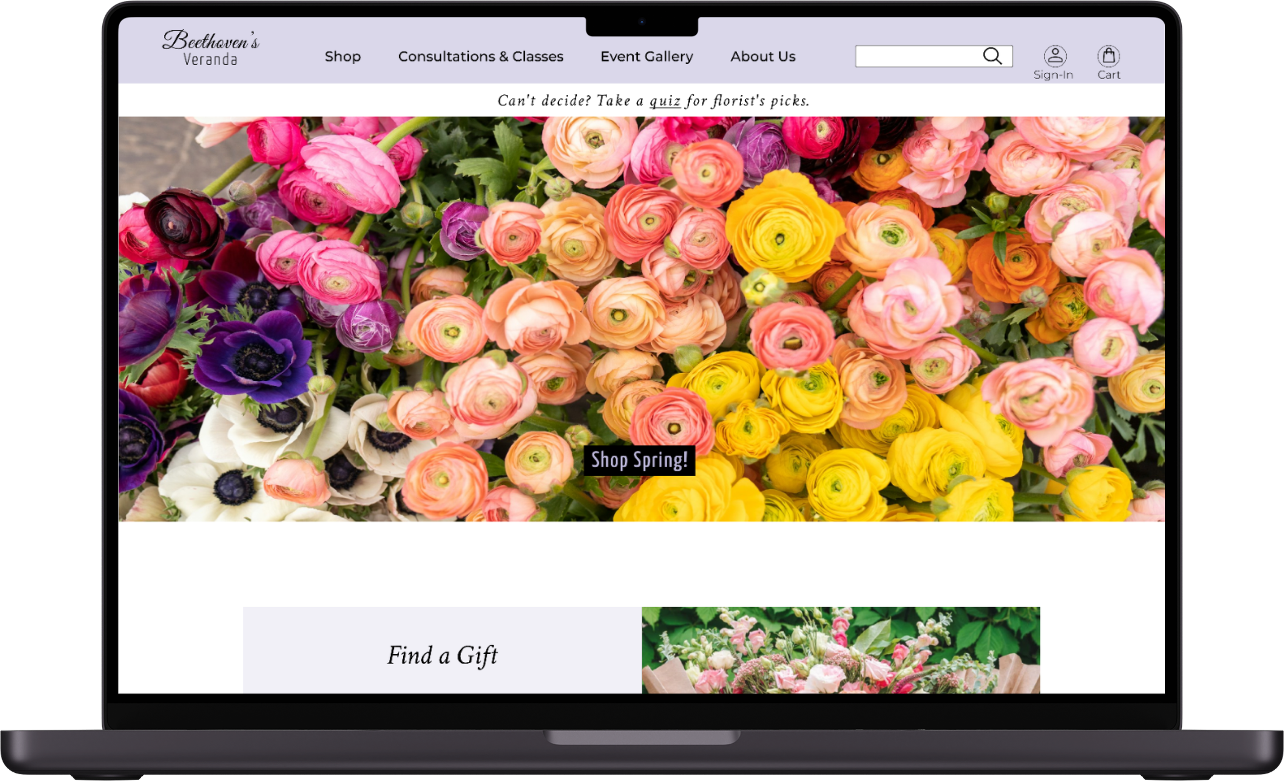
Quiz feature
Introduce a ‘quiz’ feature to reduce decision overload and recommend personalized bouquets.
DESIGN DECISION #3
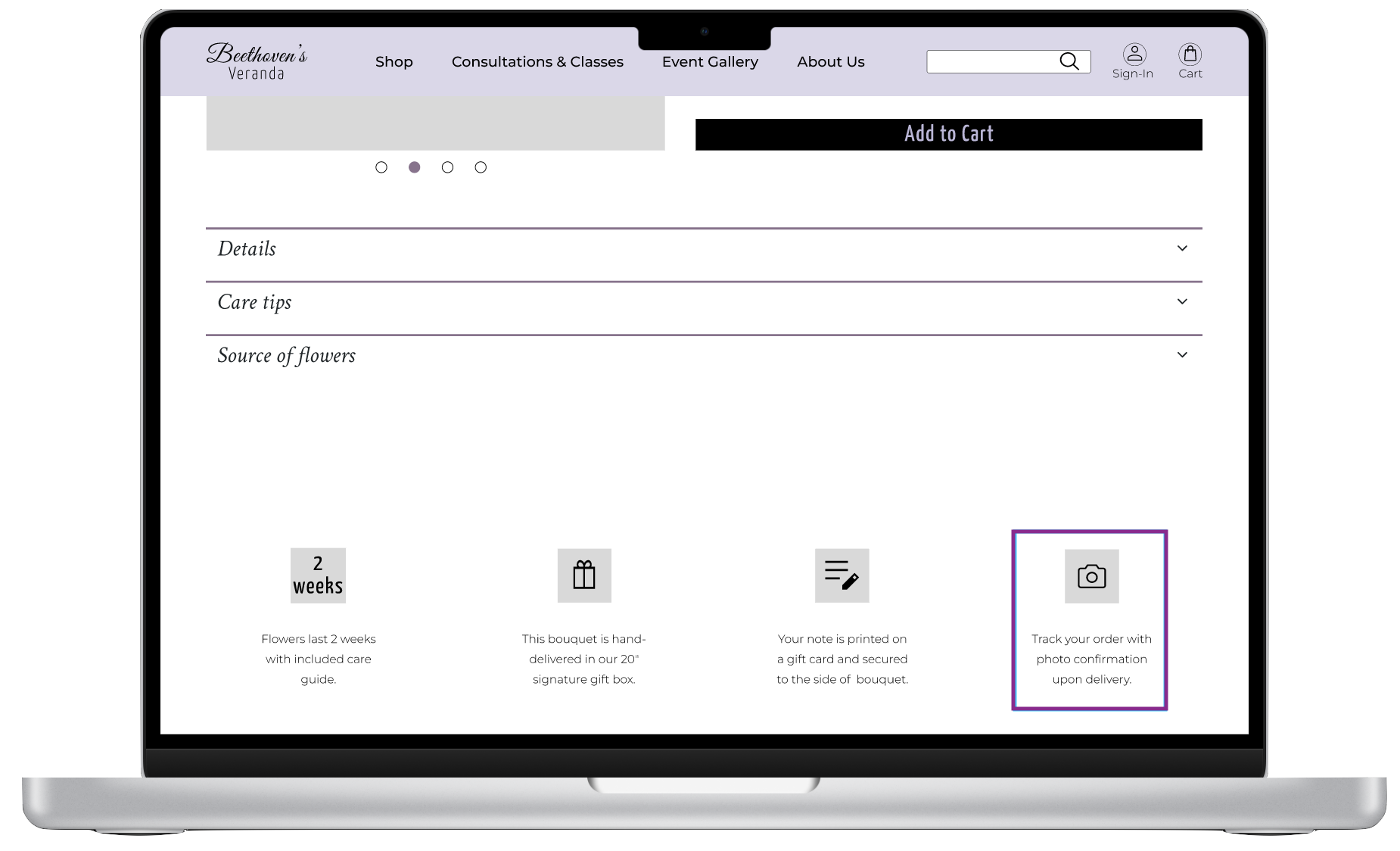
Empower users on product page with key details like bouquet size, vase selection, care tips, packaging, order tracking and add-on options.
Product Page Enhancements
DESIGN DECISION #4
Post Purchase Connect
Streamlined post-purchase information on a dedicated page after checkout.
TESTING
Usability Testing
I conducted 3 usability tests to evaluate the redesigned website's effectiveness for key tasks: finding bestsellers, filtering by delivery date/zip code, accessing product details, and completing checkout.
2 of 3 users found ‘Gala Collection’ unclear.
Renamed to ‘Celebratory Collection’ in hi-fidelity for better clarity.
“When it comes to gifting flowers, I rely on recommendations; I love the Quiz option.”
2 of 3 users were confused by the camera logo above Track Your Order on product page.
This was addressed by designing two separate icons for order tracking and photo confirmation upon delivery.
With the feedback from users, I created hi-fidelity versions of the mid-fidelity screens and added color and images to further represent BV’s branding, ultimately creating the hi-fidelity screens.
RESULT
Final Prototype
First Website (re)design: This website redesign marked my first foray into web design. The sheer amount of "real estate" on a website compared to a mobile app initially surprised me. However, the challenge quickly turned into an exhilarating learning experience. I embraced the opportunity to explore creative layouts and user flows on a larger canvas. This project solidified my enjoyment of UX design and the importance of adapting to different design contexts.
TAKEAWAYS
Thank you for spending some quality time on this case study.


